How to Use Charts and Graphs Effectively
Choosing the Right Visual For Your Data

© GettyImages
M-image
Bring your data to life with engaging charts and graphs.
Visual representations help us to understand data quickly. When you show an effective graph or chart, your report or presentation gains clarity and authority, whether you're comparing sales figures or highlighting a trend.
But which kind of chart or graph should you choose? If you click on the chart option in your spreadsheet program, you'll likely be presented with many styles. They all look smart, but which one works best for your data, and for your audience?
To figure that out, you need a good understanding of how graphs and charts work. This article explains how to use four of the most common types: line graphs, bar graphs, pie charts, and Venn diagrams.
How to Tell a Story With Charts and Graphs
The main functions of a chart are to display data and invite further exploration of a topic. Charts are used in situations where a simple table won't adequately demonstrate important relationships or patterns between data points.
When making your chart, think about the specific information that you want your data to support, or the outcome that you want to achieve.
Keep your charts simple – bombarding an audience with data will likely leave them confused and uncertain, so remove any unnecessary elements that could distract them from your central point.
Note:
Our brains process graphical data in a different way to text. Your audience will subconsciously seek a visual center that draws their attention. Only use bright colors for areas that you want to emphasize, and avoid tilting or angling your chart, as this can cause confusion.
Warning:
If the data doesn't support your point of view, avoid manipulating it to do so. This is not only unethical, it's also relatively easy to spot for anyone who is experienced in analyzing data.
How to Create Basic Graphs and Charts
The word "chart" is usually used as a catchall term for the graphical representation of data. "Graph" refers to a chart that specifically plots data along two dimensions, as shown in figure 1.
Figure 1: x- and y-Axes
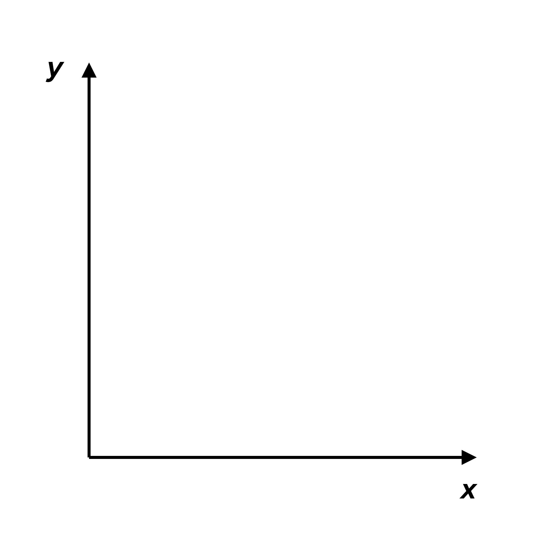
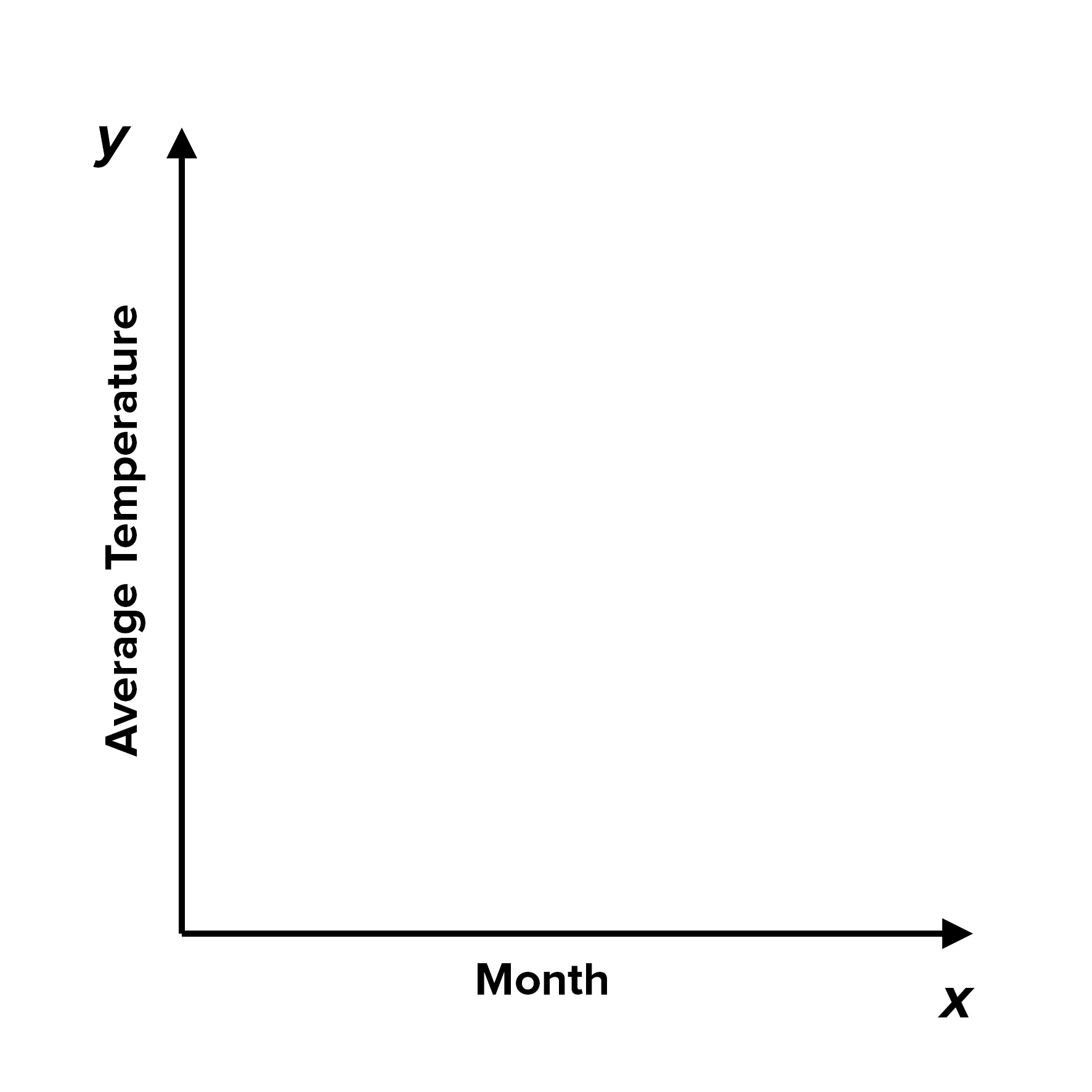
When you plot your data, the known value goes on the x-axis and the measured (or "unknown") value goes on the y-axis. For example, if you were to plot the measured average temperature for a number of months, you'd set up axes as shown in figure 2:
Figure 2: The Known Value Goes on the Horizontal x-Axis and the Measured Value on the Vertical y-Axis
The following sections cover the most commonly used types of data visualization.
Line Graphs
One of the graphs you will likely use most often is a line graph.
Line graphs simply use a line to connect the data points that you plot. They are most useful for showing trends and for identifying whether two variables relate to (or "correlate with") one another.
Examples of trend data include how sales figures vary from month to month, and how engine performance changes as the engine temperature rises.
You can use correlation data to answer questions like, "On average, how much sleep do people get, based on their age?" or "Does the distance a child lives from school affect how frequently they are late?"
Note 1:
Data can be continuous or discontinuous (or discrete).
Continuous data is measured, and can represent any value on a continuous scale: height, weight and time are all examples of continuous data.
Discontinuous data is not measured but counted: numbers of employees in a company or cars in a traffic jam are examples of discontinuous data.
Along the x-axis of a line graph, you can only use continuous data. This is because line graphs are used to make a direct link between the data points. If the variables are not continuous, a bar graph is probably more appropriate. (See the section on bar graphs, below.)
Using Line Graphs: An Example
ABC Enterprises' sales vary throughout the year. By plotting sales figures on a line graph (as shown in figure 3), you can see the main fluctuations during the course of a year. Here, sales drop off in June and July, and again towards the end of the year.
Figure 3: Example of a Line Graph
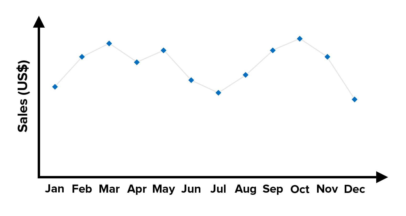
While some seasonal variation may be unavoidable for ABC Enterprises, it might still be possible to boost cash flows during the low periods through marketing activity and special offers.
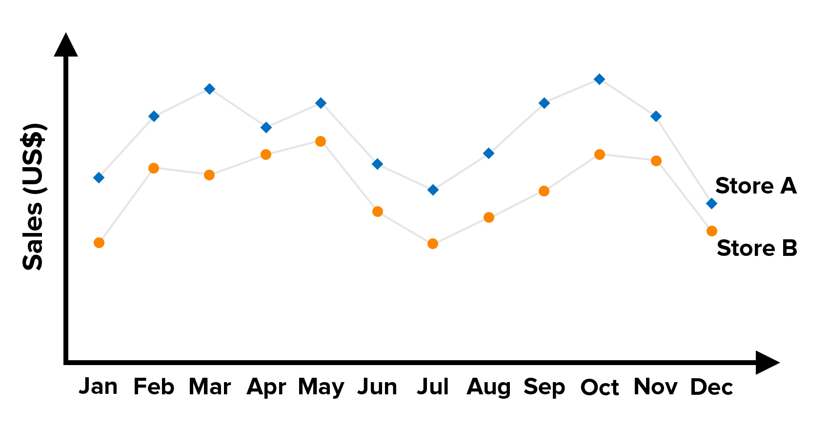
Line graphs can show more than one line or data series, too. It's easy to compare trends when you represent them on the same graph.
For example, you might have different lines for different product categories or store locations, as shown in figure 4, below.
Figure 4: Example of a Line Graph With Multiple Data Series
Bar Graphs
Another type of graph that shows relationships between different data sets is the bar graph.
In a bar graph, the height of the bar represents the measured value: the higher or longer the bar, the greater the value.
Using Bar Graphs: An Example
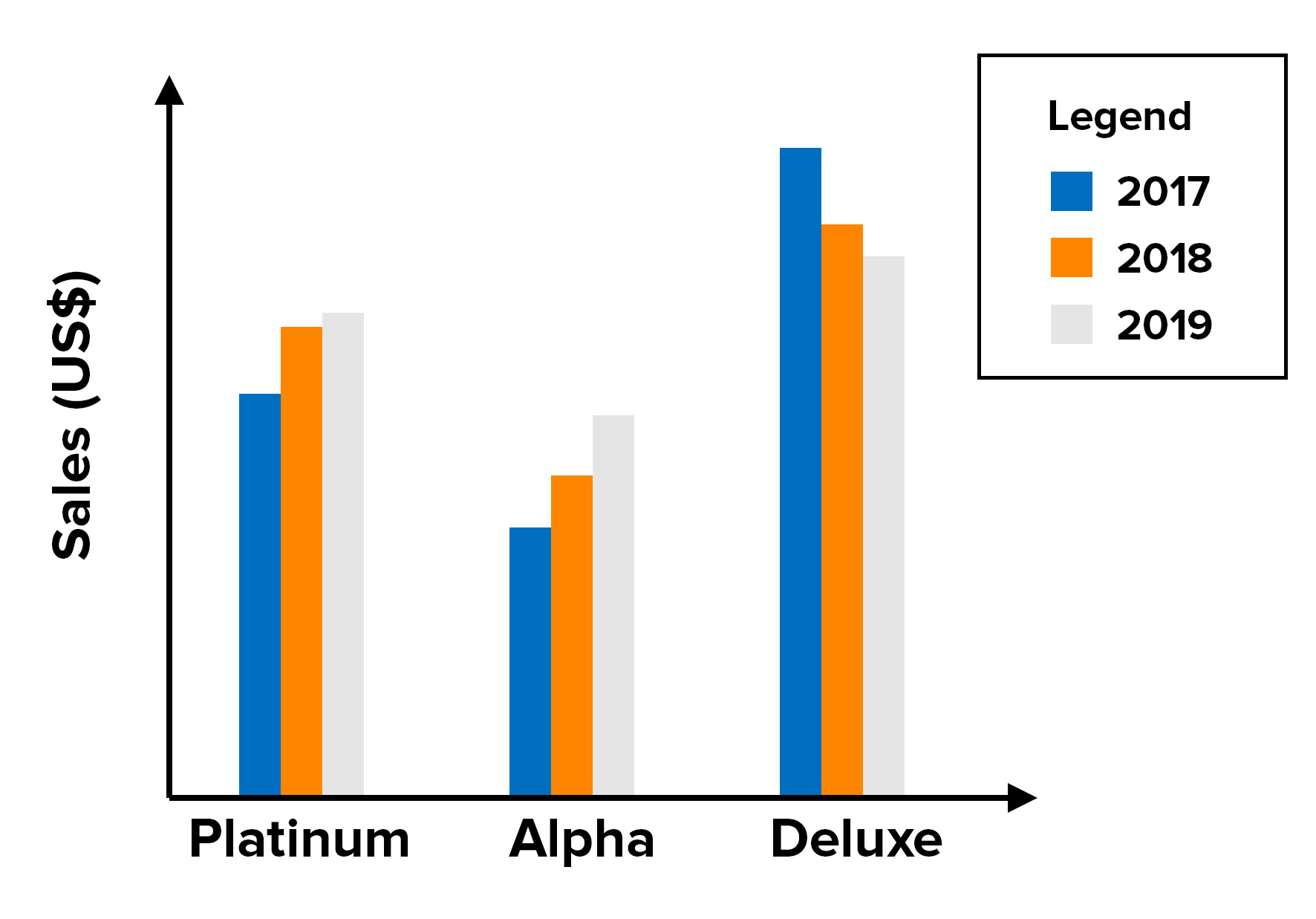
ABC Enterprises sells three different models of its main product: the Alpha, the Platinum, and the Deluxe. By plotting the sales of each model over a three-year period, you can see trends that might be masked by a simple analysis of the figures themselves.
In figure 5, it's clear that although the Deluxe is the highest-selling, its sales have dropped off over the three-year period, while sales of the other two have continued to grow.
Perhaps the Deluxe is becoming outdated and needs to be replaced with a new model. Or it could be suffering from stiffer competition than the other two models.
Figure 5: Example of a Bar Graph
You could also represent this data on a multiple-series line graph, as shown in figure 6.
Figure 6: Data From Figure 5 Shown on a Line Graph
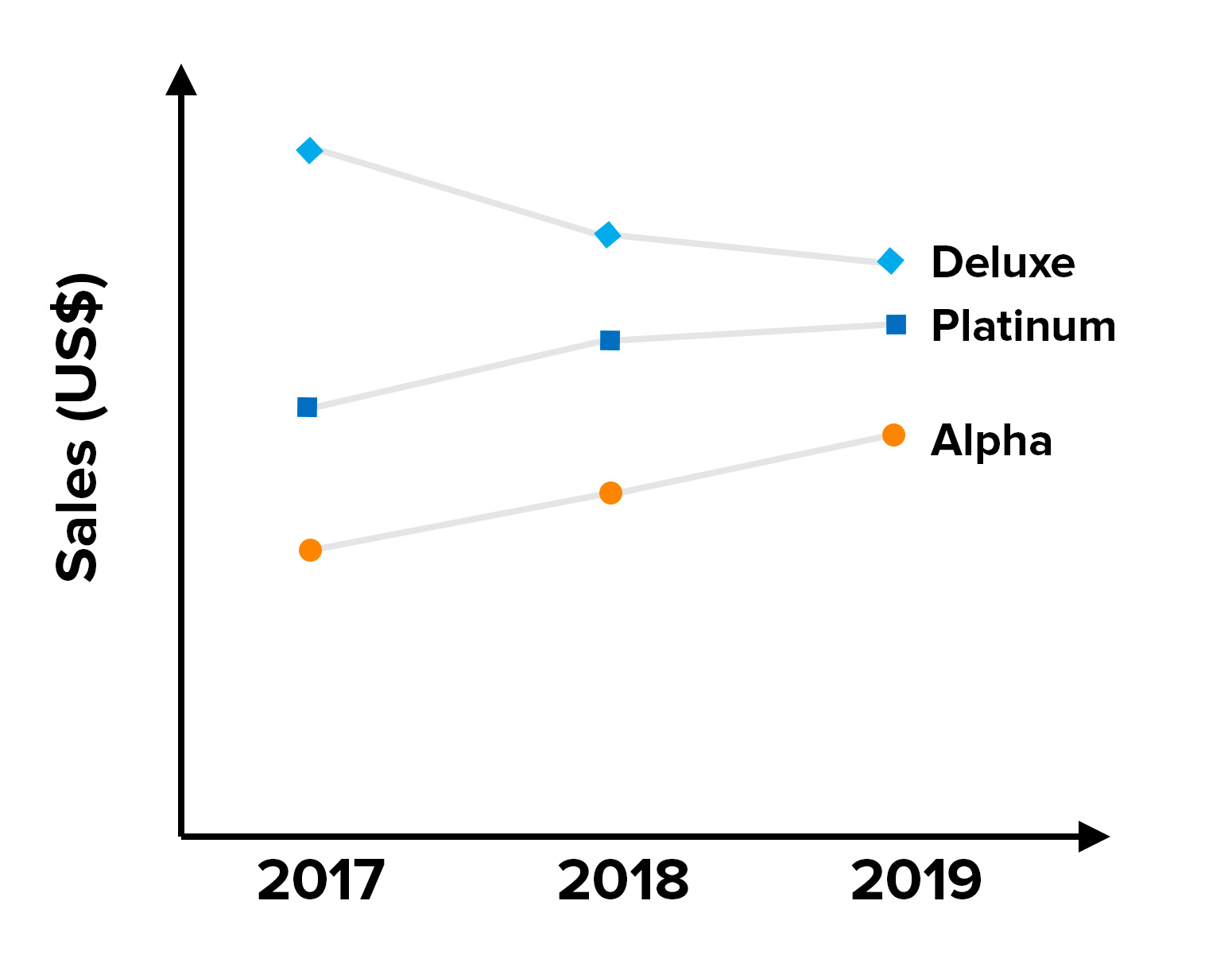
Often, the choice of which style to use comes down to how easy the trend is to spot. In this example, the line graph works better than the bar graph, but this might not be the case if the chart had to show data for 20 models, rather than just three.
Generally, if you can use a line graph for your data, a bar graph will often do the job just as well. However, the opposite is not always true: when your x-axis variables represent discontinuous data (such as employee numbers or different types of products), you can only use a bar graph.
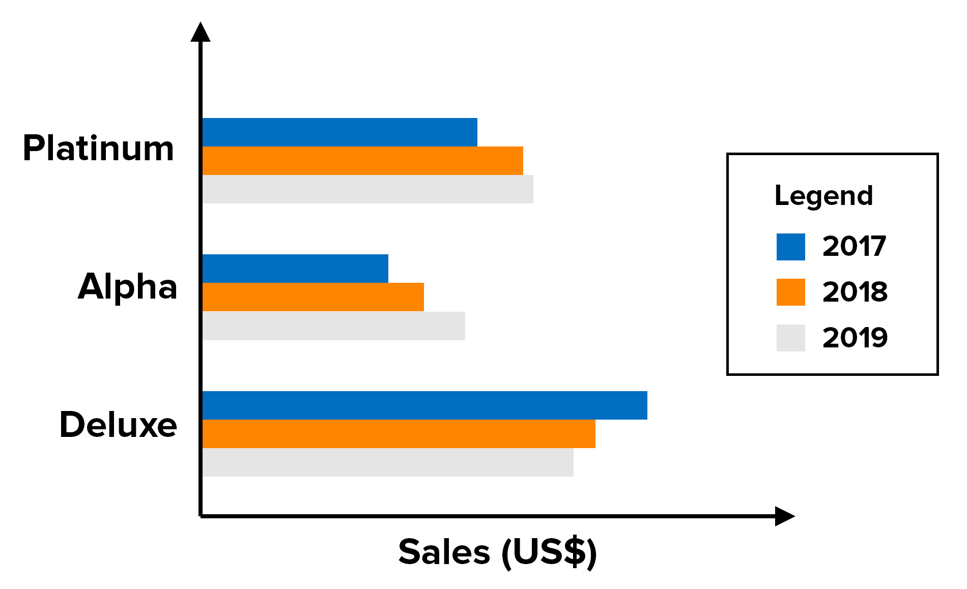
Data can also be represented on a horizontal bar graph, as shown in figure 7. This is a better method when you need more space to describe the measured variable. It can be written on the side of the graph rather than squashed underneath the x-axis.
Figure 7: Example of a Horizontal Bar Graph
Pie Charts
A pie chart compares parts to a whole. As such, it shows a percentage distribution. The pie represents the total data set, and each segment of the pie is a particular category within the whole.
To use a pie chart, the data you are measuring must depict a ratio or percentage relationship. Each segment must be calculated using the same unit of measurement, or the numbers will be meaningless.
Using Pie Charts: An Example
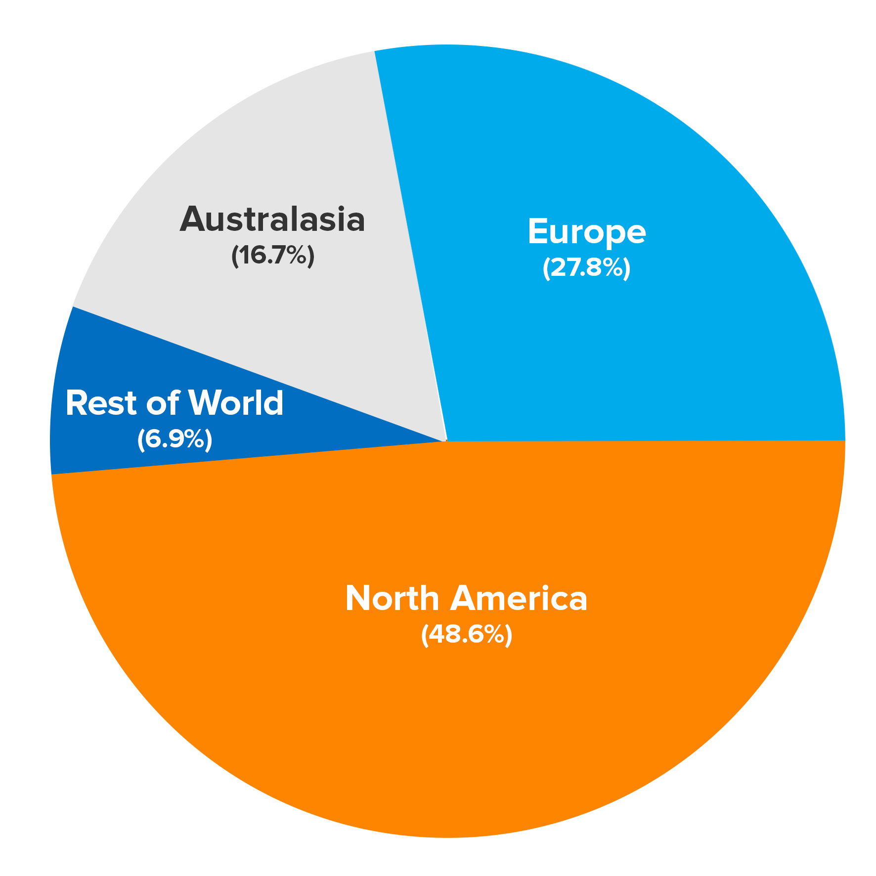
The pie chart in figure 8 shows where ABC Enterprises' sales come from.
Figure 8: Example of a Pie Chart
Tip 1:
Be careful not to use too many segments in your pie chart. More than six and it gets far too crowded.
Tip 2:
If you want to emphasize one of the segments, you can detach it a little from the main pie.
Tip 3:
For all their obvious usefulness, pie charts do have limitations. For example, the layout can mask the relative sizes and importance of the percentages. Consider whether a bar graph would better illustrate your intentions.
Venn Diagrams
Venn diagrams show the overlaps between sets of data.
Each set is represented by a circle. The degree of overlap between the sets is depicted by the amount of overlap between the circles.
A Venn diagram is a good choice when you want to convey either the common factors or the differences between distinct groups.
Using Venn Diagrams: An Example
Figure 9 shows sales at Perfect Printing. There are three product lines: stationery printing, newsletter printing, and customized promotional items, such as mugs.
Figure 9: Example of a Venn Diagram
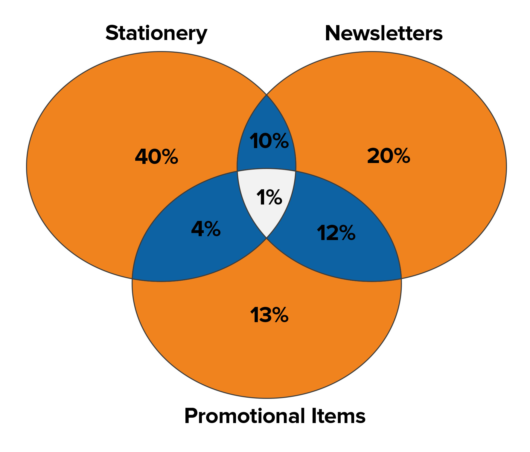
By separating out the customers by the type of product that they buy, it becomes clear that the biggest group of customers (55 percent of the total) are those buying stationery printing.
But, most stationery customers are only using Perfect Printing for stationery (40 percent). They may not realize that Perfect Printing could also print their company newsletters and promotional items. Perfect Printing could consider some marketing activity to promote these product lines to its stationery customers.
Newsletter customers, on the other hand, seem to be well aware that the company also offers stationery printing and promotional items – 23 percent of newsletter printing customers also buy other products.
Tip:
Try creating a few example charts using Excel, Google Sheets or other chart-making software. Get comfortable entering data and creating the charts so that when you need to create one for real, you are well prepared.
Key Points
Charts and graphs help to express complex data in a simple format. They can add value to your presentations and meetings, improving the clarity and effectiveness of your message.
There are many chart and graph formats to choose from. To select the right type, it's useful to understand how each one is created, and what type of information it is used for. Are you trying to highlight a trend? Do you want to show the overlap of data sets, or display your data as a percentage?
When you're clear about the specific type of data that each chart or graph can be used with, you'll be able to choose the one that best supports your point.
This site teaches you the skills you need for a happy and successful career; and this is just one of many tools and resources that you'll find here at Mind Tools. Subscribe to our free newsletter, or join the Mind Tools Club and really supercharge your career!


It is a simple installation of charts and graphs from a template.
Thank you for the feedback. I agree that information on Radar Charts does not appear in the article. Because of their multi-variate use, they are somewhat complex to describe and/or use. The charts in the article are the most commonly used.
BillT
Mind Tools Team